
This one is wild. If you’re looking for a SaaS website that nails both SaaS website best practices and pushes creative boundaries, Adaline is the perfect stylistic inspiration.
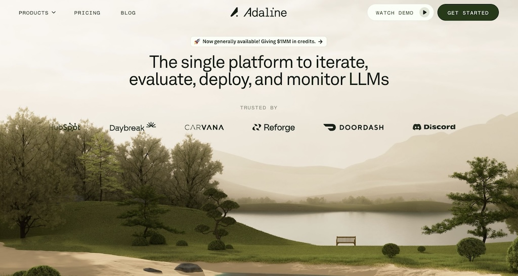
Adaline is a SaaS product that serves as an “end-to-end platform” (their words) for product and engineering teams building AI-powered applications. It helps teams iterate, evaluate, and monitor their LLMs (Large Language Models) all in one place.
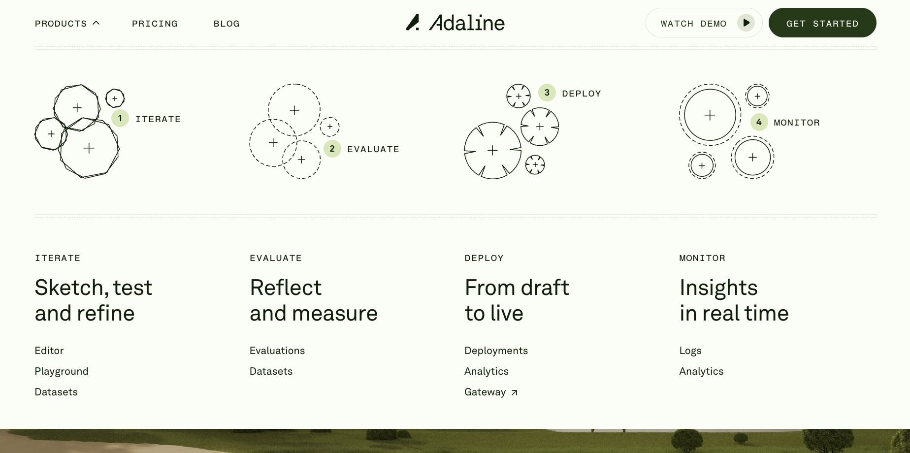
What makes their SaaS website design so sick is the immersive experience. You’re immediately hit with a intriguing loading screen, then the hero image section has a mind-blowing parallax scroll effect that transitions into a nature environment. It’s the kind of bold design project that makes you keep scrolling and actually engage with the page.
The color schemes also blend naturally with the environmental theme, creating a cohesive earthy experience that drives user engagement from the first scroll to the last.
The navbar
Adaline’s navbar has a user-friendly design. It’s clean, minimal, and purposeful — it doesn’t overwhelm with complex dropdowns but still guides visitors to essential pages about the platform, feature suite, and resources. The call-to-action buttons are perfectly placed without disrupting the flow (with cool hover animations).
The pricing page
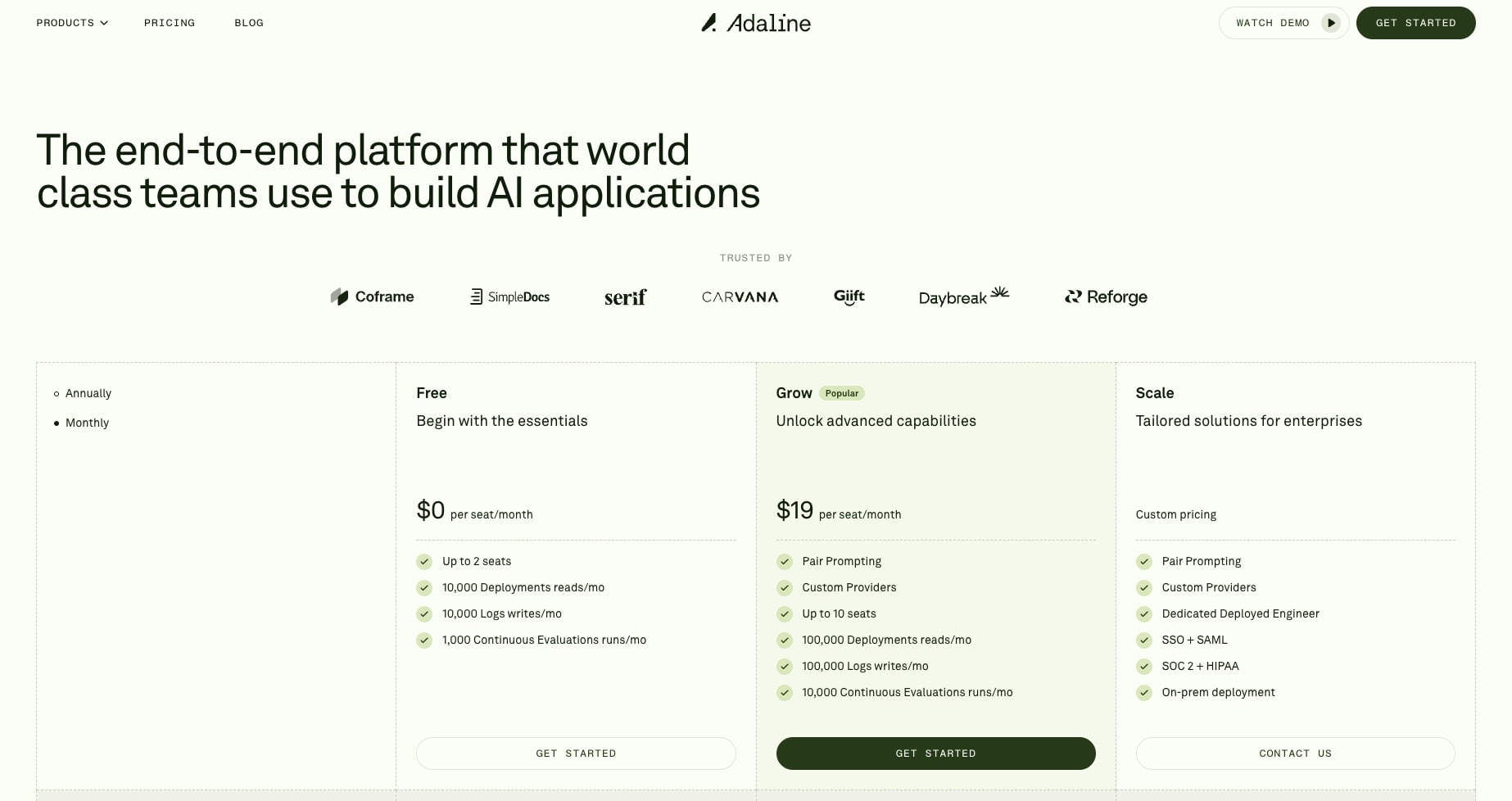
Adaline’s pricing page is a masterclass in transparency and SaaS website best practices. They offer three clear tiers, Free, Grow, and Scale, with a detailed comparison table that breaks down exactly what you get. The toggle between monthly and annual pricing is smooth (although it is a bit hidden at first), and they’re not afraid to show their usage-based pricing for additional deployments and evaluations.
This level of transparency help builds trust with visitors and helps potential customers make informed decisions without needing to “contact sales” for basic pricing info (which most SaaS sites do at this level).
The blog
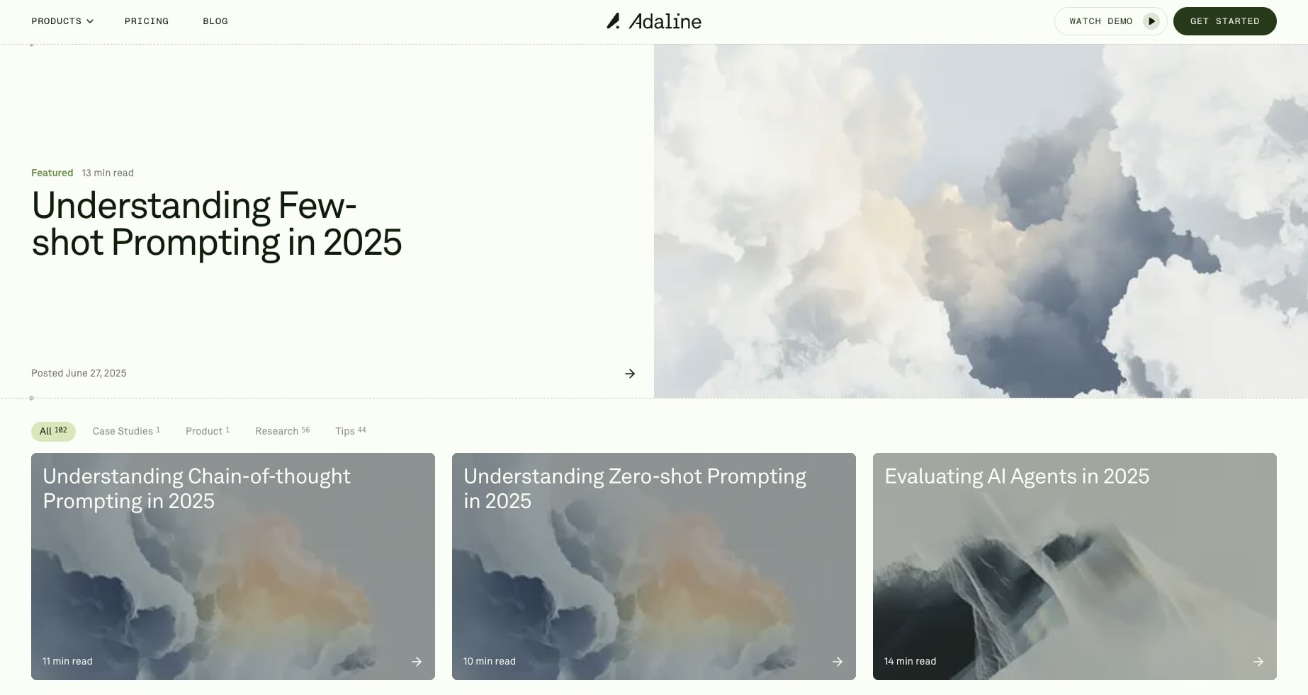
The Adaline blog takes a more refined, educational approach compared to typical SaaS blogs. Instead of dumping out SEO-focused AI slop content, they publish in-depth technical articles like their featured piece on “Understanding chain-of-thought prompting.” The clean design and focus on quality over quantity shows they’re targeting a sophisticated audience of AI practitioners who value deep insights over surface-level content.
What makes Adaline one of the best SaaS websites is how every element, from the nature-themed parallax effects to the transparent pricing to the thoughtful blog content, works together to create a consistent brand experience. The testimonials from Discord, Coframe, and McKinsey also add great social proof for larger companies that are interested in checking them out.
This SaaS website proves that enterprise B2B SaaS tools can push creative boundaries while not going overboard or confusing people. It’s a masterclass in modern SaaS website design that other companies should absolutely gain inspiration from for their next design project.